Postmortem of my #30DayMapChallenge 2022
Bits and bobs of why and how I craft those maps
By Kenneth Wong in Behind the Scene Cartography
January 28, 2023
TL;DR
Same as 2021 and 2020, I joined the #30DayMapChallenge again. The November Twitter timeline became an online gallery with tons of gorgeous and mind-blowing maps available.
Using my own words in 2021 again:
Every challenge / competition / assignment / whatever should ends with a postmortem to remind myself what I did well and did not that good, as well as things I wanna do and tried to do. This post is some random murmurs on the behind-the-scenes, the good and the bad, reflections or footnotes of the maps I produced.
I joined 14 themes this year as stated in the table below. Let’s review the maps I made this year again.
| Day | Theme | Topic | Area | Main Tool Used |
|---|---|---|---|---|
| 1 | Points | Land and sea surface temperature | Global | ArcGIS Pro |
| 2 | Lines | Nearest seaports | Global | QGIS |
| 3 | Polygons | Peak, Voronoi diagram | Hong Kong | ArcGIS Pro |
| 4 | Colour Friday: Green | Country parks | Hong Kong | ArcGIS Pro |
| 5 | Ukraine | #popelevation | Ukraine | R |
| 6 | Network | Street orientation | Hong Kong | R |
| 8 | Data: OpenStreetMap | Data versioning | Hong Kong | QGIS |
| 12 | Scale | Railway, general-use map | Tokyo | ArcGIS Pro |
| 13 | 5 minute map | Walking accessibility | London | QGIS |
| 14 | Hexagons | Location of fast food chain stores | London | ArcGIS Pro |
| 15 | Food/drink | ibid. | ibid. | ibid. |
| 16 | Minimal | Contour lines | Mount Fuji | QGIS |
| 24 | Fantasy | Railway | Taiwan | ArcGIS Pro |
| 25 | Colour Friday: 2 colours | Population census | England and Wales | QGIS |
The maps
Day 1: Points
I’ve already made up my mind from the beginning that the first map should be a global map. Since individuals can always look to the map to see where they are located, a global-scale map would work much better in reaching audiences globally.
Finding a relevant dataset and making it understandable is the issue. I attempted to plot all monthly temperatures in 2021 after seeing the Land surface and sea surface temperature dataset on the NASA Earth Observations website. It turns out that the points are 1. difficult to read when formatted in small multiples, and 2. difficult to distinguish when the size varies (temperature changes). Viewing 12 maps with a lot of dots on them at once on a computer screen is not practical.
Tools used: ArcGIS Pro + Illustrator
#30DayMapChallenge Day 1 - Point
— Kenneth Wong (@Kenneth_KHW) November 1, 2022
Land & Sea surface temperature on August 2022, in 1-degree points ⛰️ 🌊 pic.twitter.com/BCAcaSUyRG
https://twitter.com/Kenneth_KHW/status/1587440008855982082
Day 2: Lines
This is more of an exercise for me to familiarize myself with QGIS’s Geometry Generation tool. I made a list of the ten seaports that are closest to each seaport point, listing them in order of proximity. The next step is to create a line geometry that connects two ports, with the order recorded as an attribute of it.
Last year, I scribbled down the fundamentals of producing lines with point attributes. When I started working on this map, I also referred to the blog.
Tools used: QGIS + Illustrator
#30DayMapChallenge Day 2 - Lines
— Kenneth Wong (@Kenneth_KHW) November 3, 2022
~2,800 sea ports, with lines connected to their 10 most nearest neighbour ports. Don’t even ask what does this map mean. pic.twitter.com/cN8Jo3DyCa
https://twitter.com/Kenneth_KHW/status/1587966565605322753
Day 3: Polygons
Confession: I made this map in the middle of 2021, and I’ve kept it there ever since. Initially, I had intended to write it as a comprehensive piece introducing voronoi diagram the general public. And I obviously failed in the end.
Confession II: The inspiration for this map came from https://www.esri.com/arcgis-blog/products/arcgis-living-atlas/mapping/where-is-the-nearest-national-park/.
The basemap of this map, though, is something I’m very fond of. I made a polygon to clip off all the sea area in the satellite images (which doesn’t look that great), and then used a bluish-green color to denote the sea region. I believe the satellite image does a good job of capturing the beauty of Hong Kong’s peaks and mountains.
Tools used: ArcGIS Pro + Illustrator
#30DayMapChallenge Day 3 - Polygons
— Kenneth Wong (@Kenneth_KHW) November 3, 2022
Voronoi diagram / Thiessen polygon map showing the nearest principal peak (summit of the most well-known hills) from anywhere in #HongKong. 🥾⛰️
Made with #ArcGISPro + Maps for Adobe pic.twitter.com/y6qmOgYU7H
https://twitter.com/Kenneth_KHW/status/1588169906314686466
Day 4: Colour Friday: Green
One of the late entries. This map is more of an experiment or a short task to combine hillsides and slopes rasters in various resolutions to create a visually appealing overview of the mountains. Since the variety of the terrain and topography is what makes the country parks exciting and fascinating, I am a big fan of integrating slope rasters to emphasize the cliffs and other steep spots.
For Esri’s original multi-directional hillshade, I added a green hue. And the scale is yet another ripoff of John Nelson’s map heck series.
Tools used: ArcGIS Pro
Late #30DayMapChallenge Day 4 - Green
— Kenneth Wong (@Kenneth_KHW) January 9, 2023
Boundary of 24 country parks in Hong Kong. An experiment of blending and smoothing various hillshades and slopes rasters together. 🏞️ pic.twitter.com/MykfJu7wBG
https://twitter.com/Kenneth_KHW/status/1612493958109888517
Day 5: Ukraine
One of my #popelevation #joyplot series after creating the one of Taiwan and Switzerland.
Tools used: QGIS + R + Illustrator
#30DayMapChallenge Day 5 - Ukraine
— Kenneth Wong (@Kenneth_KHW) November 5, 2022
A repost of the #popelevation #joyplot of Ukraine I made earlier this year. The population data is in 2020 and population distribution should be quite different now. pic.twitter.com/fA4ykKmsUX
https://twitter.com/Kenneth_KHW/status/1588974979710078976
Day 6: Network
This map was driven by an essay I wrote in Medium in June 2022 on the street layout of various new towns in Hong Kong. I’ve included the highway and pedestrian walkway orientation distribution of three of Hong Kong’s most significant new towns in the article. It is an entertaining side project for urban analytics.
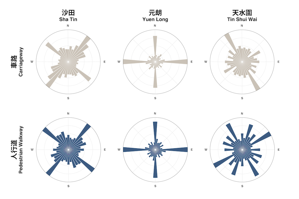
The focus of the map, once again, is on layout design. It’s not easy to figure out how to include the street network lines and the two bearing distribution into the layout.
Tools used: QGIS + R + Illustrator
#30DayMapChallenge Day 6 - Network
— Kenneth Wong (@Kenneth_KHW) November 6, 2022
Carriageways and pedestrian walkways orientation of Sha Tin New Town, #HongKong 🚗🚶🏻♂️
Made in #RStats & Illustrator pic.twitter.com/tLUc2uW8D3
https://twitter.com/Kenneth_KHW/status/1589339170354655232
Day 8: Data: OpenStreetMap
First, how should we define version number?
version- The edit version of the object. Newly created objects start at version 1 and the value is incremented by the server when a client uploads a new version of the object. The server will reject a new version of an object if the version sent by the client does not match the current version of the object in the database.
At first, I believed that obtaining the OSM objects’ edit histories would be simple. I even assumed that the Geofabrik dataset would make the version number easily accessible. It turns out that is not the case. Quoting OSM Wiki, elements’ common attributes (e.g. ud, timestamp, user) “may not need to make use of all of them, and some third-party extracts produced from OSM data may not reproduce them all”.
In the end, I created some SQL statements inside Google BigQuery using the OSM Public Dataset to obtain a “expanded” attribute table of the carriageways in Hong Kong. I then joined the table to a HK road network which I had previously downloaded.
Tools used: Google BigQuery + QGIS + Illustrator
#30DayMapChallenge Day 8 - OpenStreetMap
— Kenneth Wong (@Kenneth_KHW) November 8, 2022
Version number (i.e. how many times have the data been edited by the contributors) of road segments in #HongKong. 🛣️ Turns out one segment is in version #50 (!)
Made in #RStats & Illustrator, with gratitude to all OSM contributors pic.twitter.com/WWXSe7bhip
https://twitter.com/Kenneth_KHW/status/1590081441815498752
Day 12: Scale
When John Nelson posts a new blog or video, I personally always look for an opportunity to attempt his astounding map-making methods. His Appalachian Trail Map is so gorgeous that I tried to 1. copy the method of utilizing point symbols to illustrate the scale and 2. create an ultra-wide map.
I create a layout in ArcGIS Pro that is 1800 mm x 300 mm and then fiddle around the symbology.
As I mentioned in the tweet, the entire map still seems unfinished in my opinion, and I have the following issues with the way it appears:
- The main message cannot be delivered effectively - The Chuo Line should be the main course, particularly the way the entire line travels from Shinjuku (新宿), the busiest station in the world, through downtown Tokyo to Tachikawa (立川), a suburb of Tokyo, and eventually to the Mount Fuji region. Re-examining the map now (Jan 2023), even I found it difficult to understand the message.
- A “too-colourful” map - The background map contains an excessive amount of colors and information. Chuo Line’s orange color ought to be noticeable. The blue and green in the backdrop appear to be distracting the readers (at least they do to me). However, they are crucial for them to understand their relative location in space. Additionally, I want to figure out how to keep parks and waterways valuable. Perhaps utilizing several hatch patterns will work?
- The orange colour does not stand out - This is a map of the Chuo Line, similar to the point made above. And those who are familiar with railways should be able to tell right away which railway it is by simply examining the primary color of the map. The map needs to be more “monochrome”…
I have no idea how long this project will last. It’s possible that the project won’t be completed in the end. Who knows. ¯\_(ツ)_/¯
Tools used: ArcGIS Pro
#30DayMapChallenge Day 12 - Scale
— Kenneth Wong (@Kenneth_KHW) November 12, 2022
An ultra-wide map (180 cm x 30 cm) of Chuo Line (中央線) railway in Tokyo, Japan. Dot grid of 0.5 km is used instead of scale bars.
Still on trial and error process. Will probably revisit this map later… pic.twitter.com/lE1LdzLIh2
https://twitter.com/Kenneth_KHW/status/1591542406964740096
Day 13: 5 minute map
Almost soon after reading the challenge’s themes in mid-October, I picked the topic of “5-minute walkability.” After all, one of the main subjects I focused on for my professors’ research projects is walking accessibility.
But why not try out other places since I’ve just looked into Hong Kong’s pedestrian accessibility? The first city that came to me was, if I recall correctly, London. London Underground is something that comes with the city, therefore determining the starting location of the 5-minute reachable area / accessible area / isochrone isn’t too difficult.
For the map itself, the challenging part is mostly on blending the basemap. I tried to make a mask to somewhat mask the non-area-of-interest area in the basemap, as the 5-minute reachable area needs to stand out.
Tools used: QGIS + Valhalla
#30DayMapChallenge Day 13 - 5 minute map
— Kenneth Wong (@Kenneth_KHW) November 14, 2022
How far can you reach from London Underground stations within a 5-minute walk? pic.twitter.com/qW9dUojQkb
https://twitter.com/Kenneth_KHW/status/1592161741907316737
Day 14 & 15: Hexagons + Food/drink
The topics for these two themes are likewise chosen straight away after the 5-minute theme, in part because I had previously used hexagons to map convenience stores and in part because the turf war map of Sheetz and Wawa left a profound impression on me. You can see how this entry’s layout and legend format were influenced by Joshua Steven’s map’s design.
Since I’ve created these hexagonal maps in ArcPro before, the procedures are not very difficult. The majority of the time is spent trying various hexagon sizes in an effort to find one that works.
Pro(?) Tip: Use the faded Area of Interest overlays polygon symbol. This subtlety are hides the NOT area-of-interest… area of your map. All districts outside the London boroughs are subtly hidden from view on this map by the boroughs’ feathery edge.
Side note: Greggs and Pret A Manger were the initial two chains I wanted to compare. But then I come across this fantastic Financial Times article. After reading the post, I came to two conclusions: 1. I am re-inventing the wheel, and the wheel was created by one of the most renowned data journalism media; and 2. There are far too many Prets in central London, so comparing these two brands can only provide a map where Prets wins everywhere.
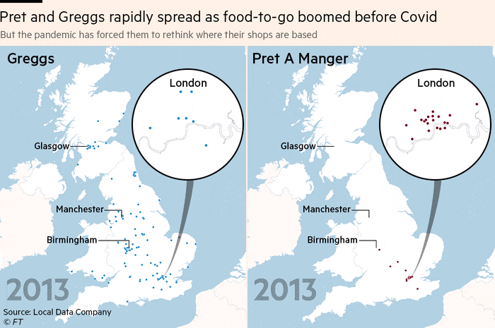
Tools used: ArcGIS Pro + Illustrator
#30DayMapChallenge Day 14 & 15 - Hexagon & Food
— Kenneth Wong (@Kenneth_KHW) November 15, 2022
How dense are Greggs & Starbucks in Greater London? Yes, I miss those fresh-baked sausage rolls from Greggs 🥐☕️
Plus a big shout-out to @undertheraedar for sharing the cleaned restaurant location data (https://t.co/bvXoCDxVaC)! pic.twitter.com/OQa9Qv0UGc
https://twitter.com/Kenneth_KHW/status/1592600930536812544
Day 16: Minimal
Minimal. Contour lines. Name the best pair.
Tools used: QGIS
#30DayMapChallenge Day 16 - Minimal
— Kenneth Wong (@Kenneth_KHW) November 16, 2022
Contour lines of Mount Fuji (富士山), Japan ⛰ pic.twitter.com/mHigXeyqop
https://twitter.com/Kenneth_KHW/status/1592992863432085504
Day 24: Fantasy
This map is (again) more like a symbology playground by blending the following John Nelson’s styles: My Precious, Pirate and Pen and Ink. How many times have I referenced John Nelson in this blog? Since I am certain that I will bring him up in the future, I have decided not to count and will certainly not count.
Finding data and modifying symbology are the only two steps involved in creating this map. The hardest step is actually locating the relevant data on the Taiwan Government’s data portal. Finding the complete collection of the following datasets actually took me a copule of hours:
- The land polygon of the whole island
- The “nature”, hilly area (shown as hills in the map)
- The railway
- The stations
It is enjoyable to mix and match various symbologies; it is similar to the feeling you get when you play with Legos and create an unknown creature. You are proud of the finished product, no matter what it looks like.
Tools used: ArcGIS Pro
#30DayMapChallenge Day 24 - Fantasy
— Kenneth Wong (@Kenneth_KHW) November 25, 2022
Railways of Taiwan, with main stations annotated. A playground of mixing n’ matching all those gorgeous styles from @John_M_Nelson. pic.twitter.com/ZZueDQ3Jjv
https://twitter.com/Kenneth_KHW/status/1596180300836794368
Day 25: 2 colours
Confession: I’m trying to find any residual topics when I was writing this blog to go with my recent article about the migration wave of Hongkongers to Britain. The map I created for that article just so happens to fit the “two colors” theme here, so it will stay here.
The legend is the most challenging aspect of this map because there is no established method for making a legend for proportional symbols that are not circles. I used Illustrator to manually create the legend1.
Tools used: QGIS + Illustrator
Late #30DayMapChallenge Day 25 - 2 colours
— Kenneth Wong (@Kenneth_KHW) January 13, 2023
Changes in the number of people born in Hong Kong (Hongkonger) living in England and Wales, 2011-2021 📈📉 pic.twitter.com/jcHihANcdK
https://twitter.com/Kenneth_KHW/status/1614004279739846657
Murmurs
It’s time to review all the maps at once after going through each one individually.
Which should I create: an artistic or informative map?
In my mind, I’ve been attempting to divide maps into “informative” maps and “aesthetic” maps. A “informative” map is essentially a thematic map or infographic that is displayed in social media to accompany a news item or blog article. In contrast, “artistic” maps are those that you would frame and hang in your home as decorations, like the historical map you could find in the living room of a random upper-class family. Examples of “artistic” maps include Day 4 (Green), Day 16 (Minimal), and Day 24 (Fantasy), while the remaining maps are primarily “informative.”
Personally, I believe informative maps are more significant and beneficial for developing cartographic skills. I don’t believe there is any chance that I could create map artwork as skillfully as those real designers did. Regarding the art sense, we are in different dimensions.
I also favor informative maps since I want them to have some sort of impact. I’ll admit that I approach map-making with a certain amount of pragmatism. One question I frequently ponder is what message or knowledge the map might convey to its viewers. In spite of the fact that artistic maps have a pleasing aesthetic, I frequently hesitate before tweeting about them.
Themes I missed
I have ideas for several themes, yet too lazy to realise them. They include:
- Day 10: A Bad Map - I thought of merging rainbow colour scale, redundant point north, wrong scale bar (and more) together. The goal? A #mappymeme shitpost.
- Day 19: Globe - Something related to polar-region, in a world-from-space projection / Globe projection.
- Day 27: Music - something about origins of various electronic music genres in UK (UK garage / UK hardcore / Sheffield Baseline / etc.), or something about great EDM club (like the Sub Club in Glasgow).
- Day 28: 3D - Some sea-level rising related maps of the Tokyo Bay area, just like what I have made for Hong Kong.
- Day 29: “Out of my comfort zone” - Some maps made with kepler.gl. I taught kepler.gl in one of the courses last semester, and I probably want to investigate the functionalities deeper.
Limiting layout design time
Since I promised to do so in the final remarks of last year’s postmortem, I made an effort to restrain myself to a 15-minute layout design time constraint. Unsurprisingly, I failed. Rarely did cartographers get the chance to perfect and continually updating the maps. I admit that I have trouble choosing on layouts, and my mind would frequently ask, “How about shifting the legend 1 inch above?”
Even if I don’t know how to fix the problem, I’ll still list it as one of the objectives for the upcoming challenge.
Closing Marks
And this is it - a loosely-structured (i.e. without structure) postmortem of what I made in Twitter last November. See you all mappies this November on Twitter again!
For the purpose of determining the size of the symbols at that value, I manually generated some fictitious data using the legend’s cut-off values (1, 100, and 250). Though I’m unsure, there ought to be some better and smarter approaches. ↩︎
- Posted on:
- January 28, 2023
- Length:
- 15 minute read, 2995 words
- Categories:
- Behind the Scene Cartography
- Tags:
- GIS ArcGIS Pro QGIS cartography R