The importance of timing: How departure time affects your urban accessibility and journey time
Reachable area (aka isochrone), but for public transit, at different times of the day
By Kenneth Wong in Data Storytelling Cartography
April 18, 2023
NOTE: This blog is originally posted on my Medium. The UI and reading experiences of Medium will sure be better than here. I just want to keep a copy of the blog in my own territory.
TL;DR
Reachable area by public transit, temporally
How far could you reach within 45-min public transit when departing at different times of the day? This blog dissect this accessibility question by:
- Discuss the general idea of reachable areas (or isochrones), which represent how far you can travel within a specific time frame.
- Extend this concept by considering departure time, and then analyse the effect of departure time on accessibility.
- Map how far you can reach from Central London within a 45-minute journey using public transit.
- Examine the results and discuss how accessibility varies throughout the day.
Most importantly, this article explores the concept of temporal isochrone - how accessibility changes throughout the day.
Part I: Mapping Your Reach - A Crash Course on Reachable Areas
Note: Feel free to skip this section if you are already familiar with the concept of reachable area/isochrone.
Reachable Area
Let’s explore the concept of travel time catchment, which refers to the area that you can reach within a given time from a specific location. For example, how far can you go within 30 minutes from Times Square in New York?
Travel-time maps1, also known as isochrones, depict the reachable area from a specific location within given time limits, using one (or more) means of transportation. Drive-time maps display the reachable area by driving, while walk-time maps illustrate the area reachable by walking2. A 15-minute walk-time map, for instance, indicates the places reachable within 15 minutes.
Reachable Area for Public Transit
Now, let’s discuss public transit catchment.
This concept is similar to the reachable area mentioned above, but with one major distinction - your mode of travel is limited to public transit and walking only.
This creates a significant difference between public transit catchment and drive-time catchment. With your own car, you can stop anywhere you want. With public transit, the places to hop on and off are limited to bus stops, train stations, and so on. The reachable area is typically smaller than the one using cars.
Additionally, the shape of travel-time maps becomes more “concentrated” in several major areas. The reachable area is segmented into sub-areas, with bus stops and train stations acting as the centroids.
Reachable Area for Public Transit at Different Times of the Day
We don’t stop there. We need to consider transit-time maps at different times of the day.
The reachable area fluctuates considerably based on the departure time. How far you can reach using buses and trains at 08:303 during the morning rush hour differs from that at 14:00 in the afternoon, 18:30 during the evening rush hour, and at midnight.
The day of the week also matters. Weekdays differ from weekends, and weekends differ from bank holidays and seasonal breaks.
For driving, congestion levels mainly affect the reachable area. For public transit, although congestion plays a role, the frequency of public transit services has the most significant impact. No one enjoys missing a bus and having to wait 15 minutes for the next one or waiting for a train after transferring from another line. Waiting for public transit is usually not a pleasant experience.
With this foundation in place, let’s dive into the main topic.
Part II: Isochrones in Practice: How Far Can You Reach from Central London within 45 Minutes?
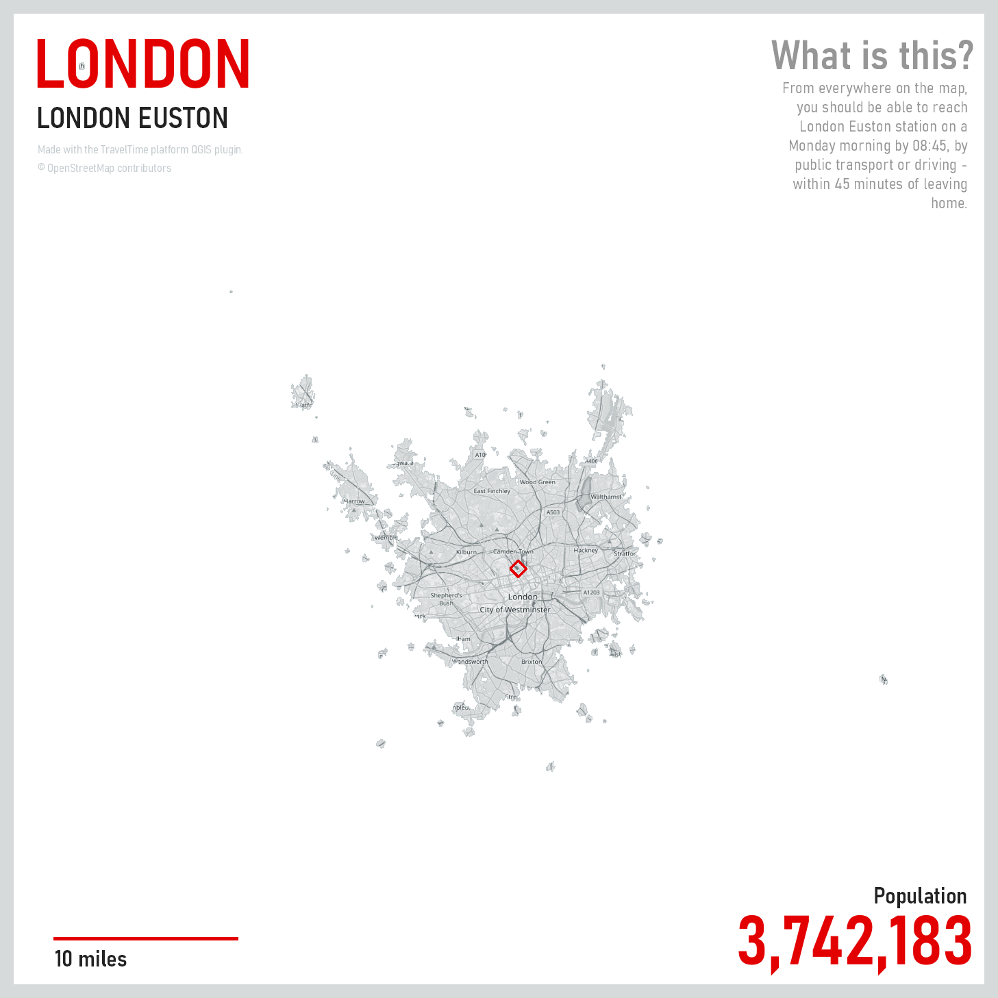
The map below shows a reachable area, or isochrone, displaying the locations reachable from London Euston station on a Monday morning within 45 minutes. This map was created by Alasdair Rae ( @undertheraedar). You can learn more about this map in his blog post about 45-minute cities.
That’s an interesting map, but what if we apply the concept of “temporal public transit isochrone” (a term I’ve coined) as defined above? This raises two major questions:
- How will the reachable area look when the mode of transport is limited to public transport, excluding driving?
- How will the reachable area differ when the starting time of travel is not 08:00, but 12:00, 16:00, or even midnight?
These questions examine the temporal differences of the reachable area (i.e., during different times of the day). To be clear, we are not talking about comparing the reachable areas within X mins (e.g. what is the difference of the 15-min reachable area and 30-minute reachable area?). The temporal here means variation of the departure time.
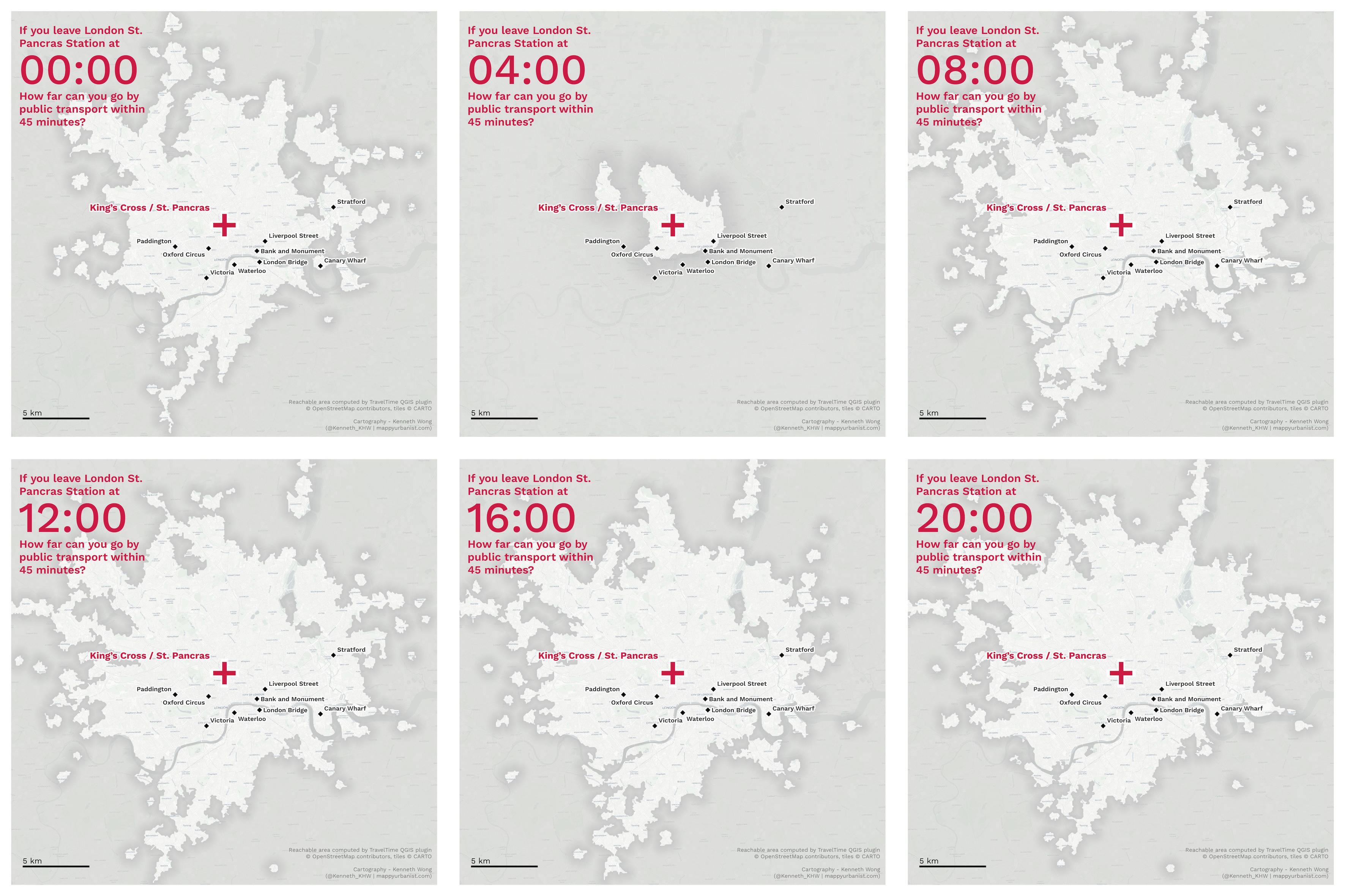
Reachable Area via Public Transit at 08:00
Using the same approach from the first section, let’s start by generating the public transit reachable area at 08:00. The map below shows the 45-minute reachable area from King’s Cross Station at 08:00, using public transit.
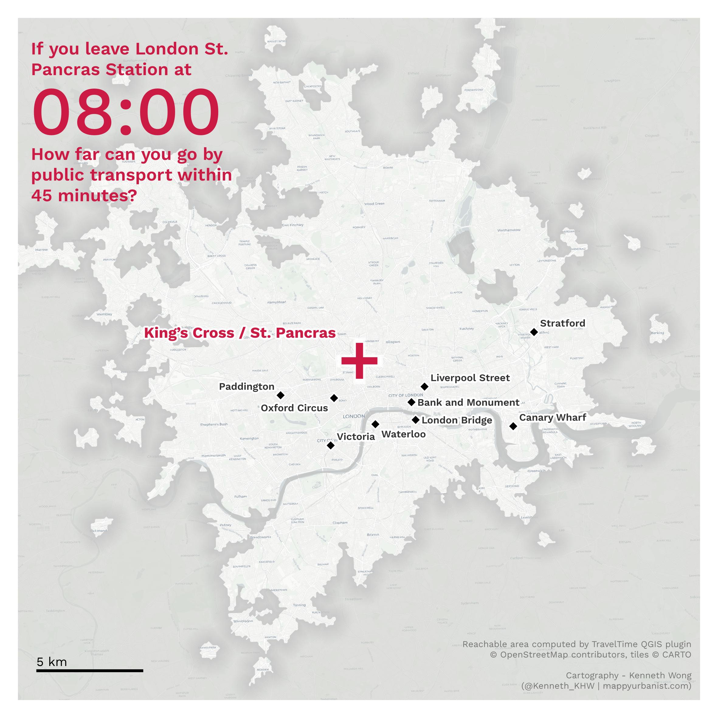
You can already spot some differences compared to the map in the previous section. The first reason for the difference is that this map shows the reachable area via public transit only.
The second point is that Rae’s map uses London Euston as the central point, while the map above uses King’s Cross. It’s a 10-minute walk from Euston to King’s Cross, and both stations can be considered to be in the “center of London.”
The third subtle difference is that Rae’s map uses central London as the destination, while this article uses central London as the origin. In other words, Rae’s map shows areas from which you should be able to reach central London by 08:45, while the map above demonstrates that from central London, you should be able to reach all points on the map by 08:45. This subtle difference can produce an isochrone with a very different shape, as travel times from A to B may not be equal to those from B to A.
How Reachable Area Changes from Dawn to Midnight
We’ve shown the reachable area at 08:00, but what about other times? Remember, we are discussing temporal differences, not just one single time. In other words, the question we are asking here is “How far can you reach from Central London within 45 minutes, departing at different times of the day?”
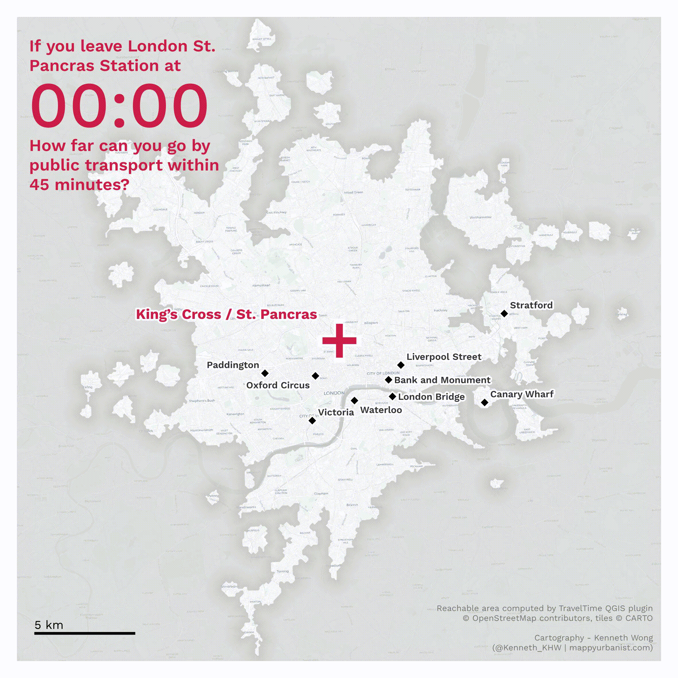
The maps below display the reachable areas from King’s Cross at six different departure times: 00:00, 04:00, 08:00, 12:00, 16:00, and 20:003.
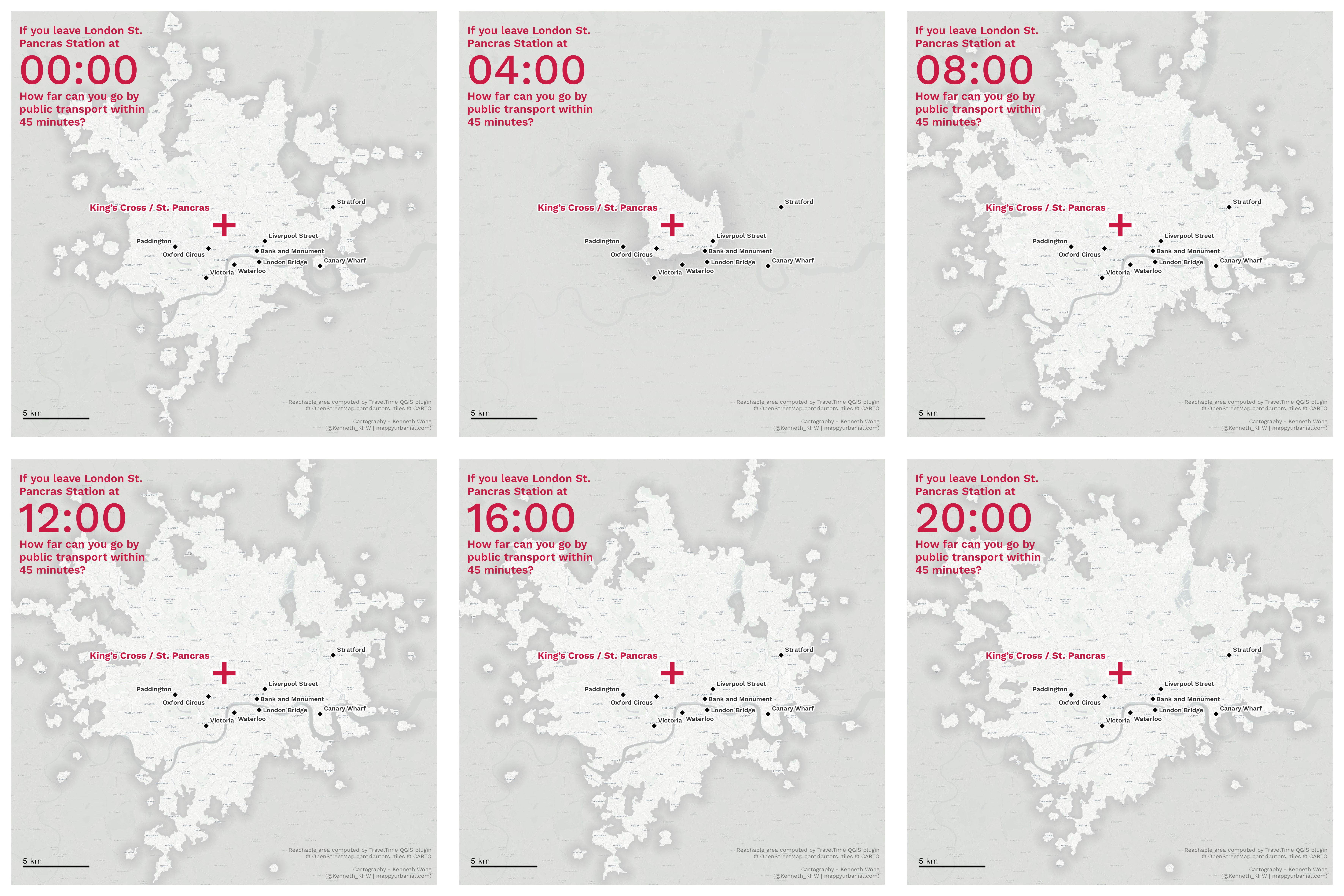
Unsurprisingly, the reachable area at 04:00 is the smallest. While some London bus routes operate throughout the night, most services are unavailable.
However, our primary interest lies in the variation of reachable area across time. Excluding the 04:00 reachable area as an outlier, we can observe how the reachable area changes throughout the day.
During the morning rush hour at 08:00, the reachable area is the largest. It becomes smaller at 12:00 and 16:00, but then increases again in the evening. Finally, the reachable area at midnight is slightly smaller than during the daytime. Although you may have to wait longer for the tube, there are still plenty of trains available at midnight.
Part III: Exploring Travel Time Variations to Major Stations Throughout the Day
You now know where you can reach within 45 minutes at different times of the day with the travel-time maps above. This answers your question of “How far can I go from central London within 45 minutes”.
However, in most cases, people are more concerned about “how long does it take to go to a known destination” rather than “how far can I go within a designated time.” In other words, what is the variation of travel time to a destination when we start the journey at different times of the day?4
The 45-minute travel-time map above is not the best tool to answer this question. With a travel-time map, you can check whether the journey time to a destination station takes longer than 45 minutes, but you cannot determine the exact journey time. Which question is more explicit: “How long does it take to arrive at station X”, or “Does it take shorter or longer than 45 minutes to arrive at station X”?
The chart below aims to answer this new question by visualizing the variation of journey time at different times of the day.
This chart is a dumbbell chart that shows the variation of journey time from King’s Cross to 9 other major stations on the Tube. The highlighted circles indicate the fastest and slowest journey times among all different departure times (excluding the journey with departure time of 04:005).
The chart displays the variation of journey times when we start the journey at different times of the day. With a longer distance to travel, the journey time will generally fluctuate more, mostly due to train frequency and transfer time while changing subway lines.
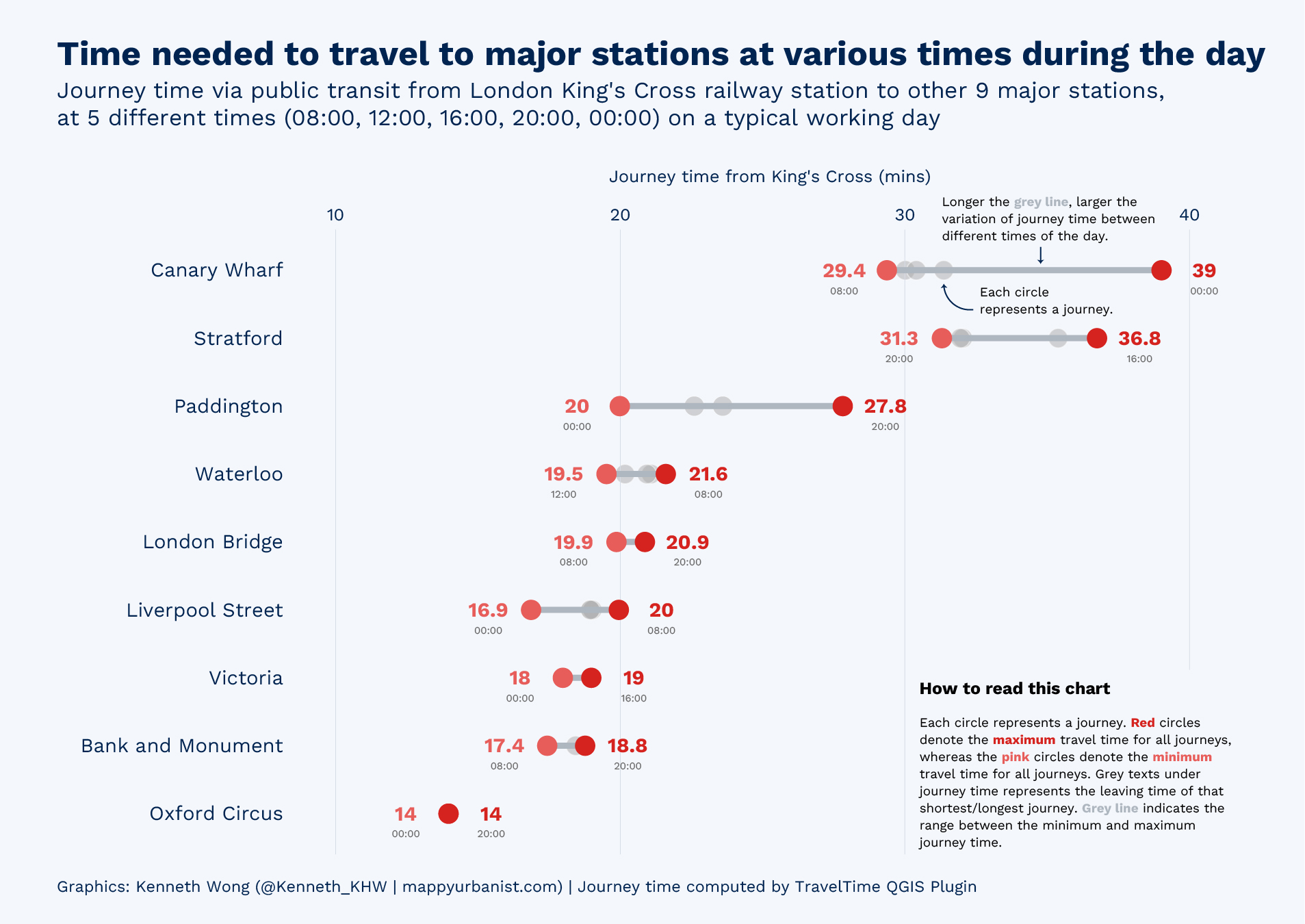
How to read this chart, from top to bottom?
The chart below shows the time required to reach different stations. Each row represents a major station on the London Tube, and the horizontal axis represents the journey time from King’s Cross Station to the station of that row. The circle on the rows represents one journey. Since we could start the journey from different times of the day, 5 different times are chosen as departure times for computation (08:00, 12:00, 16:00, 20:00 and 00:00), each row would have 5 circles.
By computing the travel time required at different times of the day, we can observe the variation of travel at different times of the day.
Among each station, the observations with the shortest and longest travel times are highlighted in pale red and red to emphasize the range of travel time. These two extreme journeys are connected by a grey line. When there is a longer grey line, we could say the variation (range) of journey time at different times of the day is larger.
Congratulations! You now know how a dumbbell chart works!
Disclaimer: The journey time data are not cross-checked (e.g., comparing it to the “canonical” TfL website). If you find some travel time discrepancies, let me know. I will be endlessly grateful for your help.
What this chart is telling you then?
Here are 2 general observations from the chart:
- The further away the destination, the larger the journey time variation.
- The minimum journey time may not always occur during rush hour.
1. The further away the destination, the larger the journey time variation
You can observe that the stations on the first few rows have a larger range of journey time at different departure times (i.e., longer grey lines).
For stations far from King’s Cross like Canary Wharf, the journey time can vary by more than 10 minutes. If you leave King’s Cross at midnight, it takes 10 more minutes for you to arrive at Canary Wharf compared to leaving at 08:00 during rush hour. While this may not be surprising, it’s worth noting that few people travel from central London to the CBD at midnight (though the reverse may be more common).
Meanwhile, for stations that are not that far away, the differences may be a few minutes. Waterloo and Liverpool Street are examples where the range of journey time is about 2 to 3 minutes.
Lastly, for Oxford Circus, the journey time is almost identical for all journeys. You can understand this by looking at the Tube Map - Oxford Circus is just a 3-station journey via Victoria Line. No interchange, no waiting time.
2. The minimum journey time may not always occur during rush hour
Is it true that the journey time will be the shortest when you leave at peak hours? Not always the case.
In the journey to Paddington, you can observe that the shortest journey was made at midnight instead of peak. Meanwhile, for the majority of other stations, we cannot observe any significant patterns between journey time and departure time for a specific destination in this case.
Of course, we cannot make any rigid conclusions when there are only 5 sample journeys for each station. If this blog were to be a journal article, more samples would be needed to show the actual distribution of journey time. Say, the journey time with departure time at 5-minute intervals, instead of 4 hours.
Remember that traffic jams and the effect of crowdedness on public transit are ignored in the estimation of travel time. In other words, only the frequency of public transit is considered.
Wrapping it Up
This is a relatively long article! Let’s try to recap what this article has presented:
- An animated map showing the temporal variation of reachable areas.
- A chart showing the temporal variation of journey times to major stations.
These two (and more) figures helped us to understand how accessibility changes throughout the day. Together with the concept of *temporal isochrone* / *temporal reachable area*, we could take a more general on how transit accessibility from Central London changes from day to night.
References
- https://pro.arcgis.com/en/pro-app/latest/help/analysis/networks/network-analyst-solver-types.htm
- https://www.geoapify.com/how-to-make-travel-time-maps-for-public-transport
- http://www.statsmapsnpix.com/2020/03/45-minute-cities.html
After doing some desktop review (aka a Twitter pool) I actually found we don’t have a generally-universal-standardised name for this “thing”. ↩︎
Urban designers and architects sometimes use the term “pedestrian shed” to refer to the reachable area for pedestrians (e.g. 5-minute pedestrian shed from the major living node). The term “shed” is not common outside the urban design field though. ↩︎
We can’t be friends if you don’t use 24-hour clock ↩︎ ↩︎
Simulating traffic jams and Tube Strikes are entirely beyond the scope of the project (I know, sorry for this cliché again). ↩︎
The journey time with a departure time of 04:00 is excluded since the journey time is much larger than all other departure times and likely becomes an outlier. Here, we are interested in the general variation of journey times, not in extreme cases. (seriously, what are the odds of some random person leaving King’s Cross at 04:00 in the morning?) ↩︎