Postmortem of my #30DayMapChallenge 2021
What I thought about when crafting maps, as well as reviews after the challenge
By Kenneth Wong in Behind the Scene
January 12, 2022
TL;DR
Same as last year, I joined the #30DayMapChallenge again. Every day, tons of gorgeous maps leaves on the Twitter timeline, allowing me to brainstorm (aka copy) those neat cartography techniques, and incorporate some fun topics into my maps.
Every challenge / competition / assignment / whatever should ends with a postmortem to remind myself what I did well and did not that good, as well as things I wanna do and tried to do. This post is some random murmurs on the behind-the-scenes, the good and the bad, reflections or footnotes of the maps I produced.
The maps
I joined 14 themes this year, one more than last year.
Day 1: Point
The first map is dedicated to a global-scale map. And the scope is chosen with purposes - a global-scale map seems easier to reach audiences worldwide, regardless of where they are living in. Though I love cities more, the audience scope of mapping one single city (esp. Hong Kong) will be too narrow.
Back to the map - it is not a tough one to make. It’s just: 1. throw a global DEM (with bathymetry data); 2. use focal statistics to reduce the DEM resolution to 2 deg x 2 deg and 3. convert the DEM raster to point.
Tools used: ArcGIS Pro + Illustrator
#30DayMapChallenge Day 1 - Point
— Kenneth Wong (@Kenneth_KHW) November 1, 2021
Elevation of the globe, sized by the absolute height above/below sea level.
FYI, we have more “deep sea” than “tall mountains” 🌊 🏔 pic.twitter.com/kfxpAldMbJ
Day 3: Polygon
Who doesn’t love paper-cut maps? And who doesn’t love animations? I wrote a post on August to remind myself how to create animations from multiple images using ffmpeg. Turns out it is a good place to store my own code.
Tools used: ArcGIS Pro + ffmpeg
#30DayMapChallenge Day 3 - Polygon
— Kenneth Wong (@Kenneth_KHW) November 3, 2021
Stacking up (and unstacking) paper-cut elevation contour polygons of Sai King Peninsula in #HongKong.
Stealing the paper cut map style from @John_M_Nelson (again) pic.twitter.com/V3tLelg5x5
Day 4: Hexagon
This is from my article on mapping the pattern of 2 major convenience stores in Hong Kong. Creating tessellation with hexagonal grids is a great thing in terms of mapping things in Hong Kong because of extremely uneven distribution of population. The hexagon net is a great to-go kit for me to transform the data from random points to some better-looking maps.
Tools used: ArcGIS Pro + Illustrator
#30DayMapChallenge Day 4 - Hexagon
— Kenneth Wong (@Kenneth_KHW) November 5, 2021
Differences of two major convenience store chains (7-Eleven vs. Circle-K) in #HongKong, binned in hexagons. Undoubtedly we have much more 7-Eleven.
An old one from my article written earlier this year: https://t.co/1klZuSy1Xf pic.twitter.com/C5UCOZnyio
Day 7: Green
I have been trying to standardise the layout for maps with informative purpose (aka the maps you see in Washington Post / Economist / NYTimes / Financial Times) starting from this map. The layout has:
- Title and subtitle on top left
- Overview map on top right
- Legend on middle, under the the title and overview map “row”
- Credits on bottom right
I took this layout (aka steal) from maps by Carl Churchill ( @Cchurchili) like this one. Things and managed in a neat and rectangular way - easy to read and no need to spend too much time optimising the layout (I am already fed up with spending hours messing up the elements around to find a good-looking layout…)
Still, I struggled a bit when adding the overview map, and now believe it is not a good idea. Not much information is added when the overview map is just pinpointing where Hong Kong is located in the geosphere. Could anyone share your thoughts about using overview map when the area shown is too tiny?
Tools used: QGIS + Illustrator
#30DayMapChallenge Day 7 - Green
— Kenneth Wong (@Kenneth_KHW) November 7, 2021
Grassland, Shrubland and Woodland in #HongKong. All these natural greens take up 66% of the land of the territory. Most of them are lying inside the mountainous country parks. pic.twitter.com/jYw1uuH7h3
Day 10: Raster
My first time trying Google Earth Engine (GEE) as I seldom play with rasters. Nighttime lights data is something I would like to play with when dealing across cities. Most of the time making this map is actually figuring out how to bulk download raster datasets from GEE to my local machine.
Always remember to use the same colour scale when mapping dataset at two different time intervals. It is such a no-brainer job with the Copy Style... function in QGIS!
Tools used: Google Earth Engine + QGIS + Illustrator
#30DayMapChallenge Day 10 - Raster
— Kenneth Wong (@Kenneth_KHW) November 11, 2021
Comparing nighttime lights between Jan 2015 and Jan 2020.
My first time playing with #EarthEngine as well as #VIIRS sensor data. Took me one night of lost sleep to find, extract and download the dataset correctly🤦♂️ pic.twitter.com/sPOQ6DRXhj
Day 11: 3D
I haven’t use rayshader much in this year, as I am focusing on 2D mapping this year. The 3D theme would be a great use case for warming up myself to mapping 3D again.
The map itself is trivial with rayshader - import the raster to R environment, then do height_shade, ray_shade and render_water. TBH I still have no idea how different shading algorithm works, and TBH I am also not that interested of going down this rabbit hole.
Tools used: R (rayshader)
#30DayMapChallenge Day 11 - 3D
— Kenneth Wong (@Kenneth_KHW) November 11, 2021
Back to #rayshader again to make a real-quick 3D view of the Challenger Deep. pic.twitter.com/euDpiZznJ7
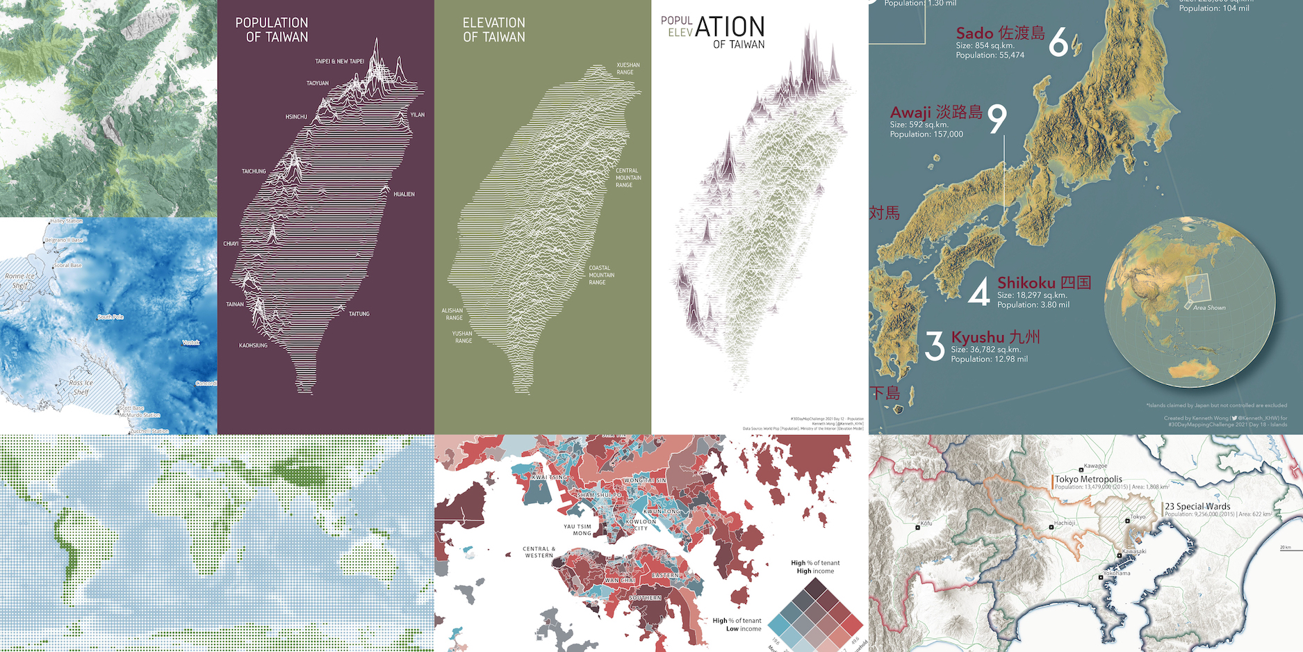
Day 12: Population
The most viral map among all of them I published this year. Coincidentally, Population is also the theme I got most likes in last year.
Seems like people loves joy plot because of its simplicity. And sometimes I struggle when I have to balance between map as art and map as infographic. Usually, I hope my maps could at least tell a story where people could know some geography trivia after looking into them. That’s why I was not pleased with just putting the population joyplot and elevation joy plot side by side.
I then tried to make the map more informative by adding the location of cities and ridges for readers to grab some random geographic knowledge of Taiwan. After some further brainstorming, I changed the storyline to “most residents in Taiwan are living along the coastline”. Is that a good storyline? maybe.
Tools used: R (ggridges) + Illustrator
#30DayMapChallenge Day 12 - Population#Joyplot of population and elevation of #Taiwan. Most people live in the coastal cities and you rarely find people living in mountainous areas.
— Kenneth Wong (@Kenneth_KHW) November 12, 2021
Made with #RStats using #ggridges pic.twitter.com/AqBsv2s38V
Day 16: Urban/Rural
This map borrows the “ 10km city squares” idea and color scheme from Alasdair Rae ( @undertheraedar). While Alasdair focuses on British cities, I cast my lights on Asian cities. Comparing urban layouts is a fun thing for urban map nerds.
The major struggle for making these layout maps is to search for the optimal line width of roads. The definition of road hierarchy (even the road network nature!) between cities could vary so much. Finding a universal width legend takes time.
Tools used: QGIS + Illustrator
#30DayMapChallenge Day 16 - Urban/Rural
— Kenneth Wong (@Kenneth_KHW) November 16, 2021
A set of 8 major asian cities, in 10 km x 10 km “squares”. Always fun to compare between urban forms and their morphologies.
Made with #QGIS pic.twitter.com/pD5BJWaLKd
Day 18: Water
I always wanna try mapping something around polar regions. After all, most of the things I am mapping are around cities.
I searched for some publicly available polar dataset and found this NY Times article on melting of Antarctica’s ice sheets. The light hillshade surrounding the land (or ice?) just catch my eyes. And I immediately decided to reserve the water theme for mapping Antarctica’s ice.

It is a great chance for me to add some label refinements in QGIS. Although I go with the ubiquitous white-halo thing, I rumbled with various options and decided that simple may be the best.
Tools used: QGIS + Illustrator
#30DayMapChallenge Day 18 - Water
— Kenneth Wong (@Kenneth_KHW) November 18, 2021
Thickness of ice sheets in Antarctica. Not until I searched for datasets of the antarctic did I realise how thick polar ice could be (It's 4.6 km deep!). pic.twitter.com/yuzL292Fvb
Day 19: Islands
A late entry! I am personally proud of the overview globe produced. The Imhof-style globe adds a fascinating crisp for the Himalayas and other high-terrain areas. I am also a fan of the original teal, greyish blue color of the sea provided in the original ArcPro style.
Side-note: I failed to export the project from ArcPro as .aix and have no idea what happened. Turns out I need to reduce the dpi when exporting the basemap from 300 dpi to 150 dpi.
Tools used: ArcGIS Pro + Illustrator
A #30DayMapChallenge map which I have put it aside for a whole month - an Imhof-style topographic map of 10 largest islands in Japan pic.twitter.com/EEqqUa7lFc
— Kenneth Wong (@Kenneth_KHW) January 11, 2022
Day 21: Elevation
Have to admit this map is half-baked and not satisfactory in my eyes. I wanna try the blend mode in ArcPro, yet fails to adjust the filters and blending mode to a state where both aerial basemap and visible area from the lookout point are eye-friendly to see at the same time.
Tools used: ArcGIS Pro
#30DayMapChallenge Day 21 - Elevation
— Kenneth Wong (@Kenneth_KHW) November 22, 2021
Visible area map (aka viewshed) from Mather Point of Grand Canyon.
Many rooms to improve as I dun hv much time to refine the details. Yet another map inspired by (& imitating) @John_M_Nelson’s masterpiece: https://t.co/n8rXMrZZgd pic.twitter.com/LPo0wq6f2l
Day 22: Boundaries
Some urban things and Japan things again. Boundaries of cities and difficult to define, as everyone has its own way to perceive what should a city be. Even whether nature reserves should be counted inside city is a question without a definite answer. Things get worse when it comes to metropolis and multi-cities.
I first thought about this idea when reading the List of metropolitan areas in Japan in Wikipedia. I have been questioning myself how large Tokyo actually is after reading how the statistical department of Japan define the boundary of Tokyo metropolitan area. And then goes into the rabbit hole of various definition of Greater Tokyo.
For the symbology, I tried to play with the Shapeburst fill / gradient fill for the boundaries ([thanks for this StackExchange question). Kind of old-school colour-at-edges symbology, yet powerful.
Side-note: I found the National Spatial Planning and Regional Policy Bureau of Japan has a new listing all canonical spatial data resources ( https://nlftp.mlit.go.jp/ksj/) earlier last year. And this website provide a HUGE variety of data! Natural resources (lakes, river, forest, etc.), administrative boundaries, railway stations and networks, ferry routes… you name it. In the old days, I had to download data from OSM, making basemap is now much simpler with all these data.
Tools used: QGIS + Illustrator
#30DayMapChallenge Day 22 - Boundaries
— Kenneth Wong (@Kenneth_KHW) November 23, 2021
Boundaries of various definitions of Greater #Tokyo Area, #Japan, as well as their total area and population. Urban boundaries are as hard to define as always. pic.twitter.com/BPJaC3WElF
Day 24: Historical
Yes. Another 3D vintage map. The shading are probably not as good as those rendered using Blender.
Tools used: ArcGIS Pro
#30DayMapChallenge Day 24 - Historical
— Kenneth Wong (@Kenneth_KHW) November 24, 2021
Yet another 3D vintage map in the sea of Twitter timeline - a “hillshaded” 1957 map of Victoria Harbour, #HongKong made by British War Office. pic.twitter.com/g9OY6maWoj
Day 26: Choropleth
When a single variable choropleth map is not enough, we play with bivariate map. Personally, I believe bivariate map shines one providing a fresh view to audiences. Two separate choropleth maps with a scatter plot may better shows the trend across the unit of analysis, but choropleth maps are “too standard” - and sometimes even myself are not interested in reading the details (sorry). I deem bivariate as a wow-factor and eye candy for readers, just like the case of waffle charts.
Tools used: ArcGIS Pro + Illustrator
#30DayMapChallenge Day 26 - Choropleth
— Kenneth Wong (@Kenneth_KHW) November 26, 2021
Bivariate map showing median household income and % of tenant households in #HongKong
Housing price is so notorious in HK - you need ~20 yrs of salary to buy a 40 sqm flat. “High” income doesn’t guarantee you living in your own flat. pic.twitter.com/hsOEpjrngX
Day 29: NULL
I made a bad map joke and is now regretting what I have done…
Tools used: QGIS + Illustrator
#30DayMapChallenge Day 29 - NULL
— Kenneth Wong (@Kenneth_KHW) November 29, 2021
"No Data" pic.twitter.com/b5crJSi78S
Epilogue
I found myself became more confident in using QGIS this year - probably because I upgraded my MacBook Pro from the old 2013 model to the M1 chip model. Everything’s running so smooth that I don’t need to always rely on the Desktop PC for map making.
There are many maps crafted by the gurus in the geospatial Twitter community (aka #gischat) that are much more professional than those published by me. I’d probably wrote another one about the favourite maps I’ve seen like Helen McKenzie did.
The thing I hope to improve most is mapping efficiency - I could easily spent an hour to meaningless decide whether the credits should align to left or right, as well as other trivial typesetting questions. For a real challenge, I may limit the typesetting time to 15 minutes next year.
- Posted on:
- January 12, 2022
- Length:
- 11 minute read, 2280 words
- Categories:
- Behind the Scene
- Tags:
- GIS ArcGIS Pro QGIS cartography