Postmortem of my #30DayMapChallenge 2024
Behind the scenes of making the maps
By Kenneth Wong in Behind the Scene Cartography
February 19, 2025
If you saw one of the maps I made for the 2024 #30DayMapChallenge and are interested in the background stories and behind-the-scenes details, you’re in the right place.
This blog includes insights and thoughts behind each map entry. While I don’t expect readers to go through all of them, I’m grateful if you’re interested in learning more about the context and information behind the maps I created.
Using my own words from 2021 (LLM revised version):
Every challenge or competition should end with a postmortem to remind myself of what I did well and what I could improve. This post reflects on the behind-the-scenes processes, the good and the bad, and the reflections or footnotes of the maps I produced.
As an additional note, I missed the 2023 challenge and failed to extend the streak from 2020. Feel free to read my postmortems from those years if you’re interested:
Themes
I created 12 maps for this year’s challenge, similar to previous years.
| Day | Theme | Topic | Area |
|---|---|---|---|
| 1 | Point | Rainfall in Aug 2024 | Japan |
| 3 | Polygons | Building age distribution | Hong Kong |
| 4 | Hexagons | Number of traffic collisions | Hong Kong |
| 5 | Journey | Railway route of the Ueno-Tokyo Line | Japan |
| 7 | Vintage Style | Submarine Cable | Asia |
| 11 | Arctic | Major cities and respective population | Arctic |
| 12 | Time and space | Variation of 45-minute reachable area at different times of day | London |
| 16 | Choropleth | Distribution of household income | Hong Kong |
| 18 | 3D | Pseudo-3D symbology | Hong Kong |
| 21 | Conflicts | Overlapped service area of 7-Eleven and Circle K | Hong Kong |
| 22 | 2 colours | Population projection | Hong Kong |
| 25 | Heat | Temperature anomaly | Japan |
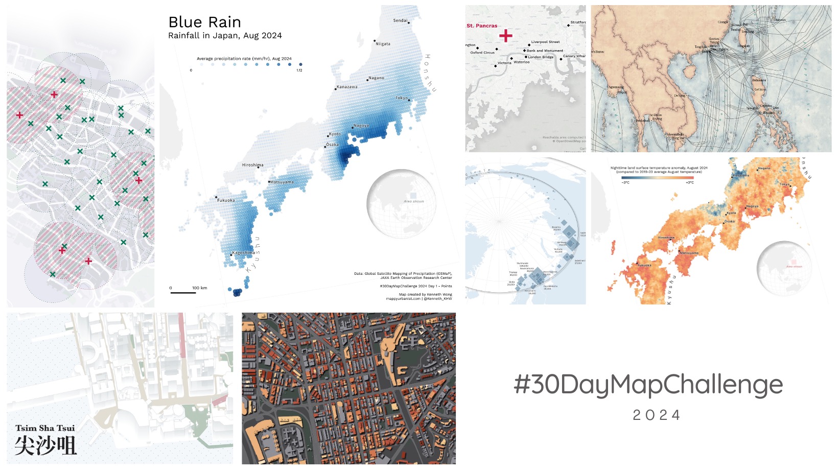
Day 1: Point
A map that received plenty of likes and reactions usually means a good start.
I didn’t have a strong theme in mind when creating this map. The process was somewhat reversed—I explored different datasets available in the JAXA Earth API until I found a suitable monthly precipitation dataset that could be presented as proportional points. The next steps involved converting the rasters to points and adjusting the symbology in QGIS.
MIERUNE deserves significant credit here. I believe every small tech firm contributing to open-source projects deserves much more respect.
Tools used: QGIS
#30DayMapChallenge Day 1 - Points
— Kenneth Wong (@Kenneth_KHW) November 1, 2024
Rainfall in Japan, Aug 2024 ☔️
Special thanks to @MIERUNE_inc for developing the JAXA Earth API QGIS plugin! pic.twitter.com/KpgHUD7qmb
https://twitter.com/Kenneth_KHW/status/1852300883142549890
Day 3: Polygon
Building age is always a relevant topic for cities and urban analytics, and I’ve had the idea of mapping building age distribution for some time. This entry fits the theme of polygons well, so why don’t put this at the theme?
The main challenge was polishing the basemap and the building polygons. I decided to create the basemap myself, which took some time to select the suitable grey color to match the building polygon color palette.
Choosing the drop shadow for the building podiums and towers was another struggle. I struggled for a long time that in the end I decided to create a pool in Instagram and sought views from friends. The drop shadow method received more support.
Tools used: QGIS
#30DayMapChallenge Day 3 - Polygons
— Kenneth Wong (@Kenneth_KHW) November 3, 2024
Age distribution of buildings in Mong Kok, Hong Kong 🏙️
Also a small experiment on the dark theme basemap pic.twitter.com/Aooya1U0Ym
https://twitter.com/Kenneth_KHW/status/1853069909649195238
Day 4: Hexagons
I have been working on the Hong Kong Traffic Injury Collision Database for over two years and knew there should be at least one map dedicated to this dataset.
I have an old blog about creating a fishnet grid and counting points. The code still worked when I prepared the grid data for this entry, making the whole map straightforward to complete.
Tools used: R (Data preparation), QGIS (map making)
#30DayMapChallenge Day 4 - Hexagons
— Kenneth Wong (@Kenneth_KHW) November 4, 2024
Traffic collisions involving pedestrains in Hong Kong, 2018 - 2023
Though I’ve worked substantially with traffic collisions data, my focus has typically been on data analysis rather than cartography pic.twitter.com/xgLcUDOdtI
https://twitter.com/Kenneth_KHW/status/1853498506855788795
Day 5: A journey
The file for this map was created three years ago when I tried to replicate the Appalachian Trail map by John Nelson. I wasn’t satisfied with the draft at the time, so threw it into the “side-projects-to-be-completed” bin.
Back to the theme and data mapped: Taking the local train and embarking on a journey of staying around 5 hours on the train was on my to-do list. I think it will never turn into reality though. And there’s nothing more nerdy than making railway maps of JR.
The data are from the National Spatial Planning and Regional Policy Bureau of Japan, which lists all canonical spatial data resources ( Link).
Tools used: ArcGIS Pro, Illustrator
#30DayMapChallenge Day 5 - Journey
— Kenneth Wong (@Kenneth_KHW) November 5, 2024
The 267.9 km local train service route of the Ueno-Tokyo Line (上野東京ライン) between Atami (熱海) and Kuroiso (黒磯), Japan
The map’s wayyyyy too long (aspect ratio 1:5) - maybe it’s better to split it in 3 and show them in replies (🧵) pic.twitter.com/ciwsE3ItDQ
https://twitter.com/Kenneth_KHW/status/1853891986690035941
Day 7: Vintage
I rarely used ArcPro in the last two years since I no longer had access to the academic institution tier subscription after leaving the university1. Picking up a stale project was the best kind of rehabilitation program to remember where the buttons are and how to make the map prettier.
The map is intrinsically adjusting the symbologies of any available data I could find. I was looking for datasets as “technologic” as possible, and submarine cable is the most “tech” dataset I could find.
Tools used: ArcGIS Pro
#30DayMapChallenge Day 7 - Vintage style
— Kenneth Wong (@Kenneth_KHW) November 7, 2024
Major submarine cable systems and land station in East and Southeast Asia pic.twitter.com/BDeXwJlnvZ
https://twitter.com/Kenneth_KHW/status/1854601483922423963
Day 11: Arctic
Late submission.
The caption of the tweet says it all - Originally, I was looking for shipping density data in the Arctic, but mapping population living in the Arctic Circle seemed more fun. The population data of each city is readily available in the Natural Earth populated place point data. I wasn’t in the mood to dig into public data at that time, so it was exactly what I needed.
The Arctic Circle line was the part I spent the most time on—I probably tested more than an hour to create the slight drop shadow of the Arctic Circle boundary and adjust the text spacings and positions of the “Arctic Circle” and “66° 34’ N” texts.
Mapping cities means I rarely have chances to deal with data in nature, and the Arctic is somewhere I don’t often map. This map was a short break and refresher for myself.
Tools used: QGIS
#30DayMapChallenge Day 11 - Arctic
— Kenneth Wong (@Kenneth_KHW) December 24, 2024
Populated Places in the Arctic Circle
Stumbled across Rovaniemi (home of Santa Claus Village) when doing some Christmas research, and ended up in the rabbit hole of exploring towns in the Arctic Circle
Mappy Christmas to you all also! 🎄🎅 pic.twitter.com/59DCbLJ2UU
https://twitter.com/Kenneth_KHW/status/1871637649959837963
Day 12: Time and space
This map is from an old article about spatiotemporal isochrones I wrote in 2023. I believe the topic fits the theme perfectly.
Visualizing spatiotemporal data is a non-trivial job. Spatial data over time adds one layer of complexity to the data. I still believe Esri’s article Six ways to visualize change over time in web maps by Kristian Ekenes provides the best overview of techniques for visualizing spatiotemporal data. Even if you are not working on web maps, small multiples and animation are the two go-to methods for clearer visualization.
Tools used: QGIS
#30DayMapChallenge Day 12 - Time and space
— Kenneth Wong (@Kenneth_KHW) November 12, 2024
Reachable areas / isochrones illustrating areas citizens can reach from central London via public transport in 45 minutes, at different times of the day
Reposting one of my old experiments ⏲️🚀 pic.twitter.com/AMLfnlkG69
https://twitter.com/Kenneth_KHW/status/1856385457397137546
Day 16: Choropleth
Late submission again.
Choropleth is such an old topic that I wanted to challenge myself to make something non-traditional. I tried a bivariate map in the 2021 challenge, so I opted for a non-static map this time.
The map was entirely generated in R and did not rely on other external software. The challenge was scaling and placing the bar chart via {patchwork} in the right position, or it would block the map and produce weird actions when hovering over the census areas.
I still think GUI is the best interface for typesetting. Unless you are generating a standard format map with a cron job to export it weekly with new data, you are probably making things more complicated.
Tools used: R
#30DayMapChallenge Day 16 - Choropleth
— Kenneth Wong (@Kenneth_KHW) February 4, 2025
Interactive map of median household income distribution in Hong Kong, made with #RStats
Challenging myself to create a non-static and non-QGIS map, despite a late submission 🤐#RSpatial pic.twitter.com/nrm1wMjVuR
https://twitter.com/Kenneth_KHW/status/1886842196672000306
Day 18: 3D
A no-stress assignment for this one. I reused some experiments for the pseudo-3D symbology I made in 2023.
I tried to expand it into a full project or article but lacked good storylines or analysis. Maybe a one-off post on social media would work best for this content.
Tools used: QGIS
#30DayMapChallenge Day 18 - 3D
— Kenneth Wong (@Kenneth_KHW) November 18, 2024
Pseudo-3D “axonometric” site plan of Tsim Sha Tsui, Hong Kong
Have to express my gratitude to @newgeographer2 again for the stunning symbology hack pic.twitter.com/50iAGEwpv2
https://twitter.com/Kenneth_KHW/status/1858573080194674908
Day 21: Conflicts
Originally, I tried to tune down the two major colours and use the blended colour multiplied by the two colours to fill the overlapping regions. The result was not satisfactory, as it was hard to distinguish between the colours, and many areas were coloured, making it difficult for readers to grasp the area of interest.
The striped lines symbology was created while experimenting with different styles. The result was surprisingly good—the striped areas were the most significant, and readers could deduce that these were the areas shown in the title. Meanwhile, they could still refer to areas covered by a single CVS brand by looking at the circle buffer. The two colours gave an indirect hint that these were the areas covered by two chains.
I am quite proud of this invention, though it might be reinventing the wheel.
Tools used: QGIS
#30DayMapChallenge Day 21 - Conflicts
— Kenneth Wong (@Kenneth_KHW) November 21, 2024
Overlapped 5-min service area of two major convenience store brands (7-Eleven & Circle K) in Central, Hong Kong
Creating some spin-offs from the cvs accessibility series I have been working on pic.twitter.com/2hK4NLOuLL
https://twitter.com/Kenneth_KHW/status/1859669079369580784
Day 22: 2 colours
This map involved playing with proportional symbols. The idea was derived from the UK population change map I made for the 2022 challenge. The map was not tailor-made for the challenge—it was originally made for my Medium article about population projection in Hong Kong. I slightly adjusted the layout and translated it to English for the challenge.
I prefer “fatter” arrows with a wide stroke instead of a thin one—sometimes the longer I stare at a long, thin arrow, the more uncomfortable I feel. Maybe because it is hard to see with a background?
This map received the fewest likes in this year’s challenge. Here are some possible reasons:
- Topic: Population distribution is interesting only when you are personally connected to that place. Population projection is, in most cases, not engaging.
- Location: Twitter is not a common social media platform in Hong Kong, and there’s nothing more niche than “Population projection in Hong Kong.” I am sure even half of the town planners in Hong Kong are not interested in this.
- Color Scheme: Red, blue, and grey. Even I feel the colors are boring when looking back. Maps with two fluorescent colours would likely catch more attention on social media.
Maybe blaming the social media timeline algorithm would make my life easier ¯_(ツ)_/¯
Tools used: QGIS, Illustrator
#30DayMapChallenge Day 22 - 2 colours
— Kenneth Wong (@Kenneth_KHW) November 22, 2024
Growth / Decline of population from 2023 to 2027 in Hong Kong, by Tertiary Planning Unit (TPU) pic.twitter.com/xv8eWb4PNE
https://twitter.com/Kenneth_KHW/status/1860030227545752046
Day 25: Heat
I think most cartographers would like heatmaps when they see the topic, which is why I didn’t want to do a heatmap.
I didn’t have an idea for this map initially. The idea sparked while exploring the JAXA data catalog again—why not make a map on temperature when we already made a map on rainfall?
Originally, I planned to show the absolute temperature of August, but it didn’t bring meaning to the data. I transformed the data from temperature to temperature anomaly. This question brings a clearer message and responds to the question I asked myself.
Back to how the map was made. Raw temperature raster data are immediately available with the JAXA plugin. I used the raster calculator to compute the average August temperature from 2019 to 2023. Getting the difference between the 2024 raster data and the 5-year average raster generated the result raster.
Tools used: QGIS
#30DayMapChallenge Day 25 - Heat
— Kenneth Wong (@Kenneth_KHW) November 25, 2024
Nighttime land surface temperature anomaly in Japan, August 2024 (compared to 2019-23 average August temperature)
It was not a hot summer, but a *scorching* hot summer in Tokyo pic.twitter.com/TI9ez2iy5b
https://twitter.com/Kenneth_KHW/status/1861139507942490302
Bits and Bobs
Goals and Expectations
I never have a clear goal when joining the challenge, deciding the themes, and posting the maps on social media. Joining the #30DayMapChallenge has become my yearly routine and the easiest way for me to enter the “map-making” community online.
I neither have the interest in nor think about making maps for 30 continuous days. I personally prefer crafting one good map instead of making a bunch of so-so maps.
For me, the challenge is about making good maps or at least copying the masterpieces from guru cartographers across the internet and creating my own versions.
It’s fun to make and share maps, and I feel great when posting the maps because it feels fun to post your works online and see others’ submissions, which in turn provides more ideas for myself on how to make great maps. The rewards are not monetary, and I hope to keep the map-making process as pure as possible.
Number of likes and reposts received are alluring—I cannot deny that one of the best feelings last November was waking up to see 10+ notifications and 100+ more likes from the map I posted the night before. Still, I am reluctant to see a challenge of personal mapping skills transformed into a program to maximize social media reach.
Maybe not setting a goal and enjoying the flow would be the best approach.
Time limits of map making
Switching from a researcher and TA role in university to a full-time job in industry means less time to work on the maps. I could work on different maps when I was not holding tutorials or working on research tasks in the old days—obviously, this is not the case anymore.
Utilising gap time during work to brainstorm ideas, sketch drafts of the map, and find ready-to-go datasets is mostly what I could do during working hours. I tried to squeeze some time after my full-time job to draw the maps.
An advantage is that I limit my time devoted to polishing the maps, especially working on some odds and ends that only make the map negligibly better. It may have achieved what I hoped to be more efficient in map-making two years ago.
I am trying to stick with a standardised layout—square backboard with title, subtitle, and footnote all fixed in locations, forcing myself not to jiggle with the title text.
And not to mention I took a one-and-a-half-week holiday in Japan during mid-November, making it impossible to finish the challenge on time. I was originally working on the Arctic Region theme while in Gifu but eventually decided to work on it when I returned to Hong Kong. Procrastination continued until I got the momentum to finish it on Boxing Day.
Easter Eggs
The greatest thing about self-initiated projects is that you can include any Easter eggs you want. I decided to devote the titles of some maps to music games at the start. Even though no one asked for it, I will share the origins of the map titles here.
| Day | Title | Name origin |
|---|---|---|
| 1 | Blue Rain | dj TAKA vs Ryu☆ - Blue Rain |
| 3 | Decade Archives | Album by Dirty Androids |
| 4 | Deadly Force | Noah - Deadly force |
| 7 | Tiefsee | SOUND HOLIC Vs. dj TAKA feat. YURiCa - TIEFSEE |
| 11 | Northern Cross | BlackY - Northern Cross |
| 22 | Around the Future | Maozon vs. C-Show - Around the Future |
| 25 | Ignited Night | HHH - Ignited Night |
To be honest, that’s the thing I miss most ↩︎
- Posted on:
- February 19, 2025
- Length:
- 14 minute read, 2790 words
- Categories:
- Behind the Scene Cartography
- See Also: