Visualing commute pattern - Story behind 2.8 million workers in Hong Kong
By Kenneth Wong in Web Application Data visualisation
February 1, 2021
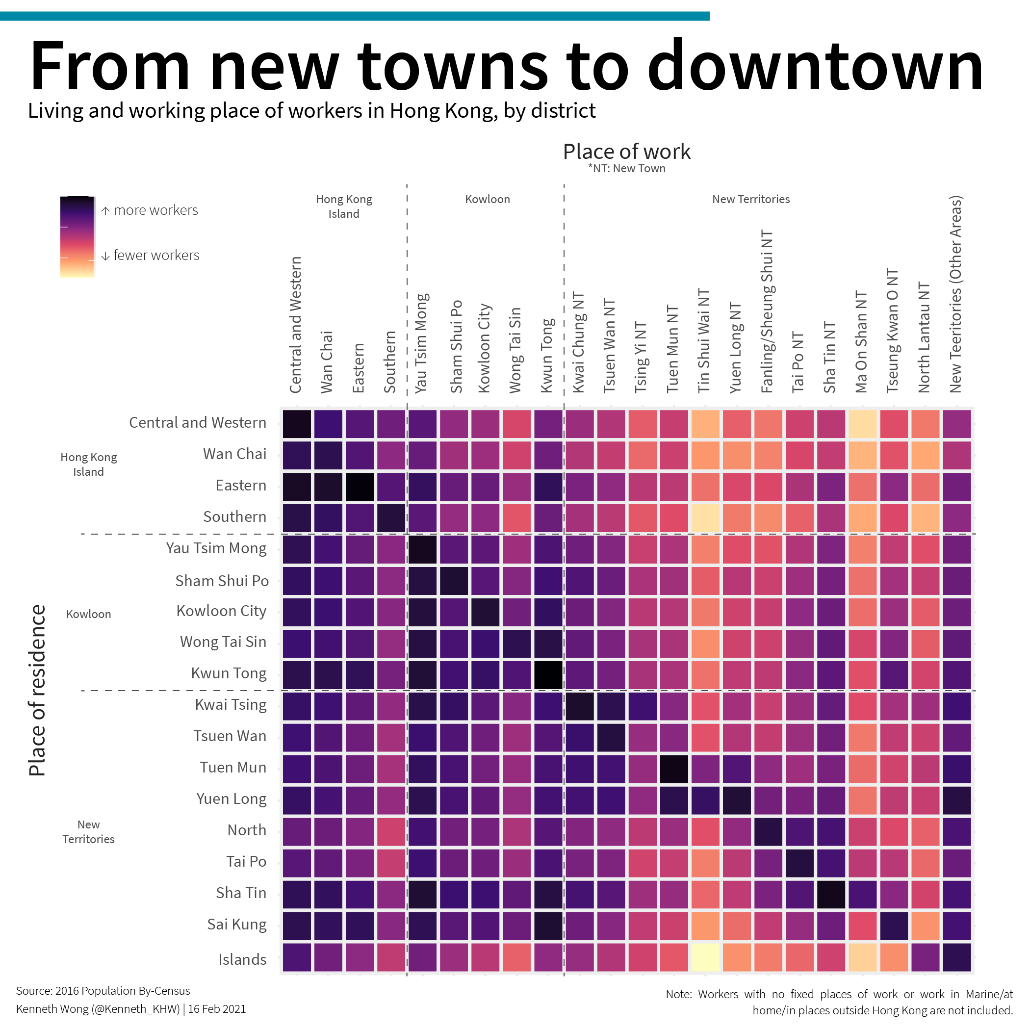
There are more than 2.8 million workers with a fixed place of work in Hong Kong. How does the overall travel pattern from their home to working place look like, when visualised? This project includes two major products:
- An data article published in Towards Data Science, one of the most prominent data science blogs in the world with 20,000,000 views per month
- An interactive web application for users to interactively explore the commute pattern on web with charts
This project is also featured in the admission poster of Master of Science in Urban Analytics (MUA) programme offered by HKU.

Admission poster of Master of Science in Urban Analytics (MUA) programme
Overview of the interactive scrollytelling web app

Sample usage of the app which allow users to select/unselect their area of interest
- Posted on:
- February 1, 2021
- Length:
- 1 minute read, 131 words
- Categories:
- Web Application Data visualisation
- Tags:
- hugo-site